Introduction:
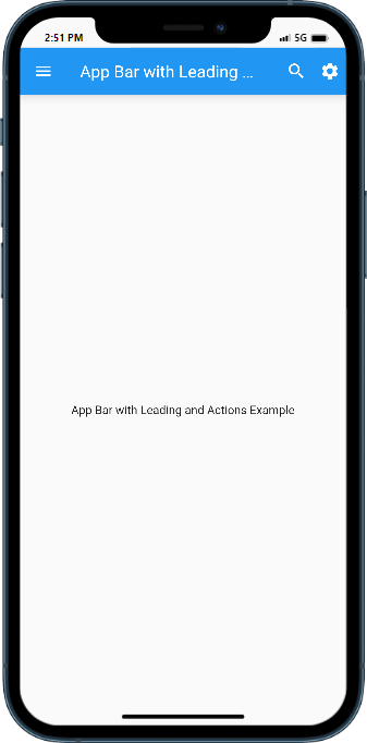
The app bar is a crucial component in a Flutter app that provides a consistent navigation and information display at the top of the screen. To make the app bar more interactive and functional, you can add leading and action widgets. The leading widget typically appears on the left side and can be used to indicate back navigation or display an app logo. The action widget(s) are placed on the right side and can include icons, buttons, or other widgets to perform specific actions or trigger menus. In this step-by-step guide, you will learn how to add leading and action widgets to the app bar in Flutter. By following this tutorial, you will be able to customize the app bar by incorporating various widgets as leading and action elements.
Content:
1. Set up a new Flutter project:
Ensure that you have Flutter installed and set up on your machine. Create a new Flutter project using the following command in your terminal:
flutter create appbar_example
2. Customize the app bar:
In the Dart file where you want to customize the app bar, import the necessary packages:
import 'package:flutter/material.dart';
Inside the build method of your widget, define the app bar and provide the desired leading and action widgets. Here’s an example:
AppBar(
  leading: IconButton(
    icon: Icon(Icons.arrow_back),
    onPressed: () {
      // Handle back navigation or custom action
    },
  ),
  actions: [
    IconButton(
      icon: Icon(Icons.search),
      onPressed: () {
        // Perform search action
      },
    ),
    IconButton(
      icon: Icon(Icons.more_vert),
      onPressed: () {
        // Display more options menu
      },
    ),
  ],
  title: Text('My App'),
),
3. Customize leading and action widgets:
You can customize the leading and action widgets based on your app’s requirements. Instead of an IconButton, you can use other widgets like FlatButton, PopupMenuButton, or even custom widgets. Add appropriate functionality to the onPressed callbacks to handle the desired actions.
4. Use the customized app bar:
In the Dart file where you want to use the customized app bar, import the necessary packages and include the customized app bar in your widget tree.
import 'package:flutter/material.dart';

class MyScreen extends StatelessWidget {
  @override
  Widget build(BuildContext context) {
    return Scaffold(
      appBar: AppBar(
        leading: IconButton(
          icon: Icon(Icons.arrow_back),
          onPressed: () {
            // Handle back navigation or custom action
          },
        ),
        actions: [
          IconButton(
            icon: Icon(Icons.search),
            onPressed: () {
              // Perform search action
            },
          ),
          IconButton(
            icon: Icon(Icons.more_vert),
            onPressed: () {
              // Display more options menu
            },
          ),
        ],
        title: Text('My App'),
      ),
      body: // Your app's content goes here
    );
  }
}
5. Test the customized app bar:
Save your changes and run the app using the following command in your terminal:
flutter run
Upon running the app, you will see the app bar with the customized leading and action widgets. Customize the leading and action widgets as per your app’s design and functionality requirements.
Sample Code:
import 'package:flutter/material.dart';

void main() {
  runApp(MaterialApp(
    home: MyApp(),
  ));
}

class MyApp extends StatelessWidget {
  @override
  Widget build(BuildContext context) {
    return Scaffold(
      appBar: AppBar(
        title: Text('App Bar with Leading and Actions'),
        leading: IconButton(
          icon: Icon(Icons.menu),
          onPressed: () {
            // Handle leading icon tap
            print('Menu icon pressed');
          },
        ),
        actions: [
          IconButton(
            icon: Icon(Icons.search),
            onPressed: () {
              // Handle search icon tap
              print('Search icon pressed');
            },
          ),
          IconButton(
            icon: Icon(Icons.settings),
            onPressed: () {
              // Handle settings icon tap
              print('Settings icon pressed');
            },
          ),
        ],
      ),
      body: Center(
        child: Text('App Bar with Leading and Actions Example'),
      ),
    );
  }
}
Output:

Conclusion:
Congratulations! You have successfully learned how to add leading and action widgets to the app bar in a Flutter app. By following this step-by-step guide, you can now customize the app bar by incorporating various widgets as leading and action elements. Utilize the leading widget to indicate back navigation or display an app logo, and leverage the action widget(s) to add interactive icons, buttons, or other widgets for performing specific actions or triggering menus. Customize your app’s app bar and provide an enhanced navigation and functionality experience to your users.


