Introduction:
Buttons are essential components in a Flutter app that allow users to interact with the UI. To make your buttons more visually appealing, you can create them with a rounded shape. A rounded shape button adds a touch of elegance and modernity to your app’s design. In this step-by-step guide, you will learn how to create a button with a rounded shape in a Flutter app. By following this tutorial, you will be able to customize the appearance of your button by applying a rounded border and adjusting its size and color.
Content:
1. Set up a new Flutter project:
Ensure that you have Flutter installed and set up on your machine. Create a new Flutter project using the following command in your terminal:
flutter create rounded_button_app
2. Implement a rounded shape button:
In the Dart file where you want to implement the rounded shape button, import the necessary packages:
import 'package:flutter/material.dart';
Inside the build method of your widget, use the ElevatedButton widget to create the button with a rounded shape:
ElevatedButton(
  onPressed: () {
    // Add your button click logic here
  },
  child: Text(
    'Click Me',
    style: TextStyle(
      fontSize: 16,
    ),
  ),
  style: ElevatedButton.styleFrom(
    shape: RoundedRectangleBorder(
      borderRadius: BorderRadius.circular(20), // Adjust the radius to change the button's roundness
    ),
    padding: EdgeInsets.symmetric(horizontal: 20, vertical: 10), // Adjust the padding for the button's size
    primary: Colors.blue, // Set the background color of the button
  ),
)
You can adjust the borderRadius property to change the roundness of the button. Use the padding property to adjust the button’s size by specifying horizontal and vertical padding values. Modify the primary property to set the background color of the button.
3. Use the rounded shape button in your app:
In the Dart file where you want to use the rounded shape button, import the necessary packages and add the button widget to your widget tree.
import 'package:flutter/material.dart';

class MyScreen extends StatelessWidget {
  @override
  Widget build(BuildContext context) {
    return Scaffold(
      body: Center(
        child: ElevatedButton(
          onPressed: () {
            // Add your button click logic here
          },
          child: Text(
            'Click Me',
            style: TextStyle(
              fontSize: 16,
            ),
          ),
          style: ElevatedButton.styleFrom(
            shape: RoundedRectangleBorder(
              borderRadius: BorderRadius.circular(20),
            ),
            padding: EdgeInsets.symmetric(horizontal: 20, vertical: 10),
            primary: Colors.blue,
          ),
        ),
      ),
    );
  }
}
4. Test the rounded shape button:
Save your changes and run the app using the following command in your terminal:
flutter run
5. Observe the rounded shape button in action:
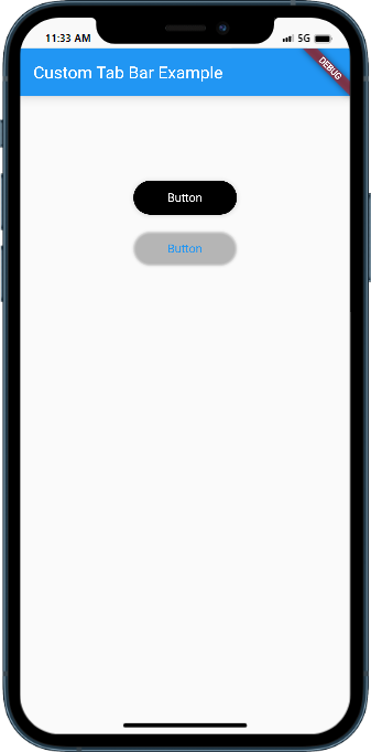
Upon running the app, you will see the rounded shape button with the specified roundness, size, and color. The button will provide a visually appealing and modern look to your Flutter app’s UI.
Sample Code:
 import 'package:flutter/material.dart';

void main() {
  runApp(MyApp());
}

class MyApp extends StatelessWidget {
  @override
  Widget build(BuildContext context) {
    return MaterialApp(
      title: 'Custom Tab Bar Example',
      theme: ThemeData(
        primarySwatch: Colors.blue,
      ),
      home: HomePage(),
    );
  }
}

class HomePage extends StatelessWidget {

  @override
  Widget build(BuildContext context) {
    return Scaffold(
      appBar: AppBar(
        title: Text('Custom Tab Bar Example'),
      ),
      body: Center(
        child: Column(
          crossAxisAlignment: CrossAxisAlignment.  start,
          mainAxisAlignment: MainAxisAlignment. start,
          children:   [
          SizedBox(height: 100,),
        ElevatedButton(

  onPressed: () {
    // Button action
  },
  style: ElevatedButton.styleFrom(

 padding: EdgeInsets.symmetric(horizontal: 40,vertical: 20),
    backgroundColor:   Colors.   black,
    textStyle:    TextStyle(  color: Colors.  white),
    shape: RoundedRectangleBorder(
        borderRadius: BorderRadius.circular(20), // Adjust the border radius as needed
    ),
  ),
  child: Text('Button'),
),
SizedBox(height: 20,),
TextButton(
  onPressed: () {
    // Button action
  },
  style: TextButton.styleFrom(
    padding: EdgeInsets.symmetric(horizontal: 40,vertical: 20),

    textStyle:    TextStyle(  color: Colors.  white),
    elevation: 1.1,
    shape: RoundedRectangleBorder(
        borderRadius: BorderRadius.circular(30), // Adjust the border radius as needed
    ),
  ),
  child: Text('Button'),
),


          ],
        ),
      )  );
  }
}
Output:

Conclusion:
Congratulations! You have successfully learned how to create a button with a rounded shape in a Flutter app. By following this step-by-step guide, you now have the knowledge to customize the appearance of your buttons by applying a rounded border and adjusting their size and color. Utilize this technique in your Flutter app to create visually appealing and modern UIs that enhance the user experience.
