Introduction:
In Flutter, implementing a circular countdown timer adds a dynamic element to your app, suitable for various scenarios like quizzes, timed challenges, or countdowns for events. The flutter_flip_counter package provides an easy way to integrate this feature, offering customization options for a personalized user experience.
Content:
Step 1: Add the dependency:
Add the flutter_flip_counter package to your pubspec.yaml file:
dependencies:
flutter_flip_counter: ^0.1.1
Save the file and run flutter pub get to install the package.
Step 2: Import the package:
Import the flutter_flip_counter package in your Dart file:
import 'package:flutter/material.dart';
import 'package:flutter_flip_counter/flutter_flip_counter.dart';
Step 3: Create the circular countdown timer widget:
Create a widget to display the circular countdown timer. Customize the timer’s duration, text style, and other properties:
class CircularCountdownTimer extends StatelessWidget {
  @override
  Widget build(BuildContext context) {
    return Scaffold(
      appBar: AppBar(
        title: Text('Circular Countdown Timer'),
      ),
      body: Center(
        child: FlipCounter.simple(
          duration: Duration(seconds: 60), // 1 minute
          value: 0,
          textStyle: TextStyle(fontSize: 60, color: Colors.blue),
          onDone: () {
            print('Countdown ended');
          },
        ),
      ),
    );
  }
}
Step 4: Run the app:
Run your Flutter app to see the circular countdown timer in action. The countdown timer will start counting down from the specified duration, and the onDone callback will be called when the countdown reaches zero.
To run the app, use the following command in your terminal:
flutter run
Sample Code:
import 'package:flutter/material.dart';
import 'package:circular_countdown_timer/circular_countdown_timer.dart';

class CircularCountdown extends StatefulWidget {
  const CircularCountdown({Key? key, this.title}) : super(key: key);

  final String? title;

  @override
  State<CircularCountdown> createState() => _CircularCountdownState();
}

class _CircularCountdownState extends State<CircularCountdown> {
  final int _duration = 10;
  final CountDownController _controller = CountDownController();

  @override
  Widget build(BuildContext context) {
    return Scaffold(
      appBar: AppBar(
        centerTitle: true,
        elevation: 2,
        title: Text(
          "circular countdown timer",
          style: TextStyle(fontSize: 22, color: Colors.black, fontWeight: FontWeight.w500),
        ),
        backgroundColor: Colors.blue[200],
      ),
      body: Center(
        child: CircularCountDownTimer(
          // Countdown duration in Seconds.
          duration: _duration,

          // Countdown initial elapsed Duration in Seconds.
          initialDuration: 0,

          // Controls (i.e Start, Pause, Resume, Restart) the Countdown Timer.
          controller: _controller,

          // Width of the Countdown Widget.
          width: MediaQuery.of(context).size.width / 2,

          // Height of the Countdown Widget.
          height: MediaQuery.of(context).size.height / 2,

          // Ring Color for Countdown Widget.
          ringColor: Colors.grey[300]!,

          // Ring Gradient for Countdown Widget.
          ringGradient: null,

          // Filling Color for Countdown Widget.
          fillColor: Colors.amber,

          // Filling Gradient for Countdown Widget.
          fillGradient: null,

          // Background Color for Countdown Widget.
          backgroundColor: Colors.purple[400],

          // Background Gradient for Countdown Widget.
          backgroundGradient: null,

          // Border Thickness of the Countdown Ring.
          strokeWidth: 20.0,

          // Begin and end contours with a flat edge and no extension.
          strokeCap: StrokeCap.round,

          // Text Style for Countdown Text.
          textStyle: const TextStyle(
            fontSize: 33.0,
            color: Colors.white,
            fontWeight: FontWeight.bold,
          ),

          // Format for the Countdown Text.
          textFormat: CountdownTextFormat.S,

          // Handles Countdown Timer (true for Reverse Countdown (max to 0), false for Forward Countdown (0 to max)).
          isReverse: false,

          // Handles Animation Direction (true for Reverse Animation, false for Forward Animation).
          isReverseAnimation: false,

          // Handles visibility of the Countdown Text.
          isTimerTextShown: true,

          // Handles the timer start.
          autoStart: false,

          // This Callback will execute when the Countdown Starts.
          onStart: () {
            // Here, do whatever you want
            debugPrint('Countdown Started');
          },

          // This Callback will execute when the Countdown Ends.
          onComplete: () {
            // Here, do whatever you want
            debugPrint('Countdown Ended');
          },

          // This Callback will execute when the Countdown Changes.
          onChange: (String timeStamp) {
            // Here, do whatever you want
            debugPrint('Countdown Changed $timeStamp');
          },

          /*
              * Function to format the text.
              * Allows you to format the current duration to any String.
              * It also provides the default function in case you want to format specific moments
                as in reverse when reaching '0' show 'GO', and for the rest of the instances follow
                the default behavior.
            */
          timeFormatterFunction: (defaultFormatterFunction, duration) {
            if (duration.inSeconds == 0) {
              // only format for '0'
              return "Start";
            } else {
              // other durations by it's default format
              return Function.apply(defaultFormatterFunction, [duration]);
            }
          },
        ),
      ),
      floatingActionButton: Column(
        mainAxisAlignment: MainAxisAlignment.end,
        crossAxisAlignment: CrossAxisAlignment.end,
        children: [
          Row(
            mainAxisAlignment: MainAxisAlignment.end,
            children: [
              const SizedBox(
                width: 30,
              ),
              _button(
                title: "Start",
                onPressed: () => _controller.start(),
              ),
              const SizedBox(
                width: 10,
              ),
              _button(
                title: "Pause",
                onPressed: () => _controller.pause(),
              ),
            ],
          ),
          Row(
            mainAxisAlignment: MainAxisAlignment.center,
            children: [
              const SizedBox(
                width: 30,
              ),
              _button(
                title: "Resume",
                onPressed: () => _controller.resume(),
              ),
              const SizedBox(
                width: 10,
              ),
              _button(
                title: "Restart",
                onPressed: () => _controller.restart(duration: _duration),
              ),
            ],
          ),
        ],
      ),
    );
  }

  Widget _button({required String title, VoidCallback? onPressed}) {
    return Expanded(
      child: ElevatedButton(
        style: ButtonStyle(
          backgroundColor: MaterialStateProperty.all(Colors.purple),
        ),
        onPressed: onPressed,
        child: Text(
          title,
          style: const TextStyle(color: Colors.white),
        ),
      ),
    );
  }
}
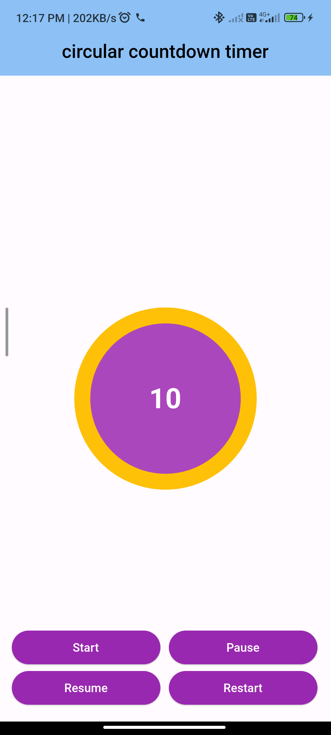
Outout:

Conclusion:
Implementing a circular countdown timer using the flutter_flip_counter package is a straightforward way to enhance your Flutter app’s interactivity. Whether for games, deadlines, or event countdowns, this feature adds a visually appealing and functional element to your UI.


