Introduction:
A responsive grid layout with an adaptive cross-axis count is a powerful technique in Flutter for creating dynamic and flexible grids that adjust based on the screen size. This allows your app to provide an optimal user experience on various devices, accommodating different screen sizes and orientations. In this step-by-step guide, you will learn how to create a responsive grid layout with adaptive cross-axis count in a Flutter app. By following this tutorial, you will be able to build a grid that automatically adapts its column count based on the available screen space, ensuring a visually appealing and user-friendly layout.

Content:
1. Set up a new Flutter project:
Ensure that you have Flutter installed and set up on your machine. Create a new Flutter project using the following command in your terminal:
flutter create responsive_grid_app
2. Implement a responsive grid layout:
In the Dart file where you want to implement the responsive grid layout, import the necessary packages:
import 'package:flutter/material.dart';
Define a stateful widget for your grid layout:
class ResponsiveGrid extends StatefulWidget {
  @override
  _ResponsiveGridState createState() => _ResponsiveGridState();
}

class _ResponsiveGridState extends State<ResponsiveGrid> {
  // Add necessary variables and methods for the grid layout
  // Example: items list, cross-axis count, grid spacing, etc.

  @override
  Widget build(BuildContext context) {
    return GridView.builder(
      gridDelegate: SliverGridDelegateWithFixedCrossAxisCount(
        crossAxisCount: // Determine the initial cross-axis count based on the screen size
      ),
      itemBuilder: (BuildContext context, int index) {
        // Build your grid items here
      },
    );
  }
}
In the GridView.builder widget, use SliverGridDelegateWithFixedCrossAxisCount as the gridDelegate to define the initial cross-axis count.
3. Determine the adaptive cross-axis count:
To make the grid layout responsive, you need to determine the adaptive cross-axis count based on the available screen space. You can achieve this by utilizing the MediaQuery class.
Add the following code inside the _ResponsiveGridState class:
int determineCrossAxisCount(BuildContext context) {
  final screenWidth = MediaQuery.of(context).size.width;
  // Define your logic to determine the adaptive cross-axis count based on the screenWidth
  // Example: return a fixed value for smaller screens and a larger value for larger screens
}
Modify the crossAxisCount property in the SliverGridDelegateWithFixedCrossAxisCount widget to use the adaptive count:
crossAxisCount: determineCrossAxisCount(context),
4. Customize the grid items:
Inside the itemBuilder function of GridView.builder, build your grid items based on the index. You can use widgets like Container, Card, or any other desired widget to represent each grid item. Customize the appearance and content of each grid item based on your app’s requirements.
5. Use the responsive grid layout:
In the Dart file where you want to use the responsive grid layout, import the necessary packages and add the ResponsiveGrid widget to your widget tree.
import 'package:flutter/material.dart';

class MyScreen extends StatelessWidget {
  @override
  Widget build(BuildContext context) {
    return Scaffold(
      body: ResponsiveGrid(),
    );
  }
}
6. Test the responsive grid layout:
Save your changes and run the app using the following command in your terminal:
flutter run
7. Observe the responsive grid layout in action:
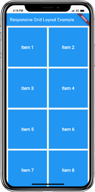
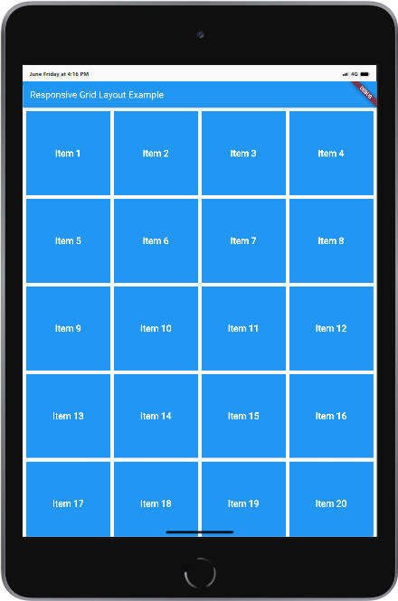
Upon running the app, you will see the responsive grid layout with the adaptive cross-axis count. The grid will automatically adjust its column count based on the available screen space, providing a visually appealing and user-friendly layout.
Sample Code:
import 'package:flutter/material.dart';

void main() {
  runApp(MyApp());
}

class MyApp extends StatelessWidget {
  @override
  Widget build(BuildContext context) {
    return MaterialApp(
      title: 'Responsive Grid Layout Example',
      theme: ThemeData(
        primarySwatch: Colors.blue,
      ),
      home: HomePage(),
    );
  }
}

class HomePage extends StatelessWidget {
  final List<String> items = List.generate(20, (index) => 'Item ${index + 1}');

  @override
  Widget build(BuildContext context) {
    return Scaffold(
      appBar: AppBar(
        title: Text('Responsive Grid Layout Example'),
      ),
      body: GridView.builder(
        padding: EdgeInsets.all(8),
        gridDelegate: SliverGridDelegateWithFixedCrossAxisCount(
          crossAxisCount: MediaQuery.of(context).size.width > 600 ? 4 : 2,
          crossAxisSpacing: 8,
          mainAxisSpacing: 8,
        ),
        itemCount: items.length,
        itemBuilder: (context, index) {
          return Container(
            color: Colors.blue,
            child: Center(
              child: Text(
                items[index],
                style: TextStyle(
                  color: Colors.white,
                  fontSize: 20,
                  fontWeight: FontWeight.bold,
                ),
              ),
            ),
          );
        },
      ),
    );
  }
}
Output:
Mobile and Tab view


Conclusion:
Congratulations! You have successfully implemented a responsive grid layout with an adaptive cross-axis count in your Flutter app. By following this step-by-step guide, you have learned how to build a dynamic and flexible grid that adjusts based on screen size, ensuring an optimal user experience on various devices. Utilize this technique in your Flutter app to create visually appealing and user-friendly layouts that adapt to different screen sizes and orientations.


