Introduction:
Adding a shadow effect to widgets can greatly enhance the visual appeal and depth of your Flutter app’s user interface. Whether it’s buttons, containers, cards, or other UI elements, applying a shadow effect can provide a subtle and realistic dimension to your app’s components. In this step-by-step guide, you will learn how to add a shadow effect to widgets in Flutter. By following this tutorial, you will be able to implement box shadows and customize their properties to achieve the desired shadow effect.

Content:
1. Set up a new Flutter project:
Ensure that you have Flutter installed and set up on your machine. Create a new Flutter project using the following command in your terminal:
flutter create shadow_app
2. Implement a widget with a shadow effect:
In the Dart file where you want to implement the shadow effect, import the necessary packages:
import 'package:flutter/material.dart';
Inside the build method of your widget, wrap the widget you want to apply the shadow effect to with a Container widget:
Container(
  decoration: BoxDecoration(
    boxShadow: [
      BoxShadow(
        color: Colors.grey.withOpacity(0.5),
        spreadRadius: 2,
        blurRadius: 5,
        offset: Offset(0, 3),
      ),
    ],
  ),
  child: // Your widget goes here
),
3. Customize the shadow effect:
You can customize the shadow effect by adjusting the properties of the BoxShadow widget. The color property determines the color of the shadow, the spreadRadius property controls the spread of the shadow, the blurRadius property sets the blur radius of the shadow, and the offset property defines the x and y offset of the shadow.
4. Use the widget with the shadow effect:
In the Dart file where you want to use the widget with the shadow effect, import the necessary packages and include the widget with the shadow effect in your widget tree.
import 'package:flutter/material.dart';

class MyScreen extends StatelessWidget {
  @override
  Widget build(BuildContext context) {
    return Scaffold(
      appBar: AppBar(
        title: Text('Shadow Effect'),
      ),
      body: Center(
        child: Container(
          decoration: BoxDecoration(
            boxShadow: [
              BoxShadow(
                color: Colors.grey.withOpacity(0.5),
                spreadRadius: 2,
                blurRadius: 5,
                offset: Offset(0, 3),
              ),
            ],
          ),
          child: // Your widget goes here
        ),
      ),
    );
  }
}
5. Test the widget with the shadow effect:
Save your changes and run the app using the following command in your terminal:
flutter run
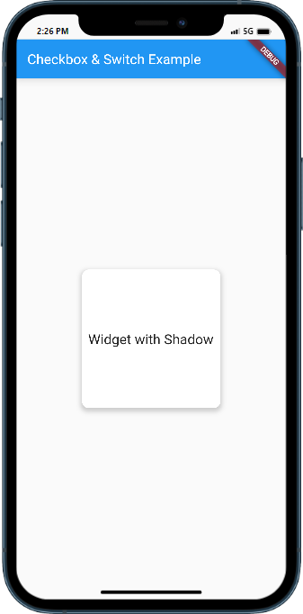
Upon running the app, you will see the widget with the applied shadow effect. Customize the shadow properties and experiment with different values to achieve the desired visual effect.
Sample Code:
import 'package:flutter/material.dart';

class CheckboxSwitchExample extends StatefulWidget {
  @override
  _CheckboxSwitchExampleState createState() => _CheckboxSwitchExampleState();
}

class _CheckboxSwitchExampleState extends State<CheckboxSwitchExample> {
  bool isChecked = false;
  bool isSwitched = false;

  @override
  Widget build(BuildContext context) {
    return Scaffold(
      appBar: AppBar(
        title: Text('Checkbox & Switch Example'),
      ),
      body: Center(
        child: Container(
          width: 200,
          height: 200,
          decoration: BoxDecoration(
            borderRadius:  BorderRadius.circular(10),
            color: Colors.white,
            boxShadow: [
              BoxShadow(
                color: Colors.grey.withOpacity(0.5),
                spreadRadius: 2,
                blurRadius: 5,
                offset: Offset(0, 3), // changes the position of the shadow
              ),
            ],
          ),
          child: Center(
            child: Text(
              'Widget with Shadow',
              style: TextStyle(fontSize: 20),
            ),
          ),
        ),
      ),
    );
  }
}

void main() {
  runApp(MaterialApp(
    home: CheckboxSwitchExample(),
  ));
}
Output:

Conclusion:
Congratulations! You have successfully learned how to add a shadow effect to widgets in a Flutter app. By following this step-by-step guide, you can now implement box shadows and customize their properties to enhance the visual appearance of your app’s components. Utilize the shadow effect to add depth


