Introduction
The app bar is a fundamental component of any Flutter app, providing a navigation and action control area at the top of the screen. In this tutorial, we will explore how to create a customizable app bar using the AppBar widget in Flutter. We’ll cover the necessary steps, provide code snippets, and highlight important points to help you build a responsive app bar for your Flutter app.
Creating an App Bar with Title
The first step in creating an app bar is to define an AppBar widget. The AppBar allows you to set a title and other optional properties. Let’s start by creating a basic app bar with a title:
import 'package:flutter/material.dart';

void main() {
  runApp(MyApp());
}

class MyApp extends StatelessWidget {
  @override
  Widget build(BuildContext context) {
    return MaterialApp(
      title: 'Flutter App Bar',
      home: Scaffold(
        appBar: AppBar(
          title: Text('My App Bar'),
        ),
        body: Container(),
      ),
    );
  }
}
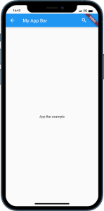
In the above code snippet, we define a MyApp class that extends StatelessWidget. The build method returns a MaterialApp widget, which is the root of the Flutter app. Inside the MaterialApp, we define a Scaffold widget that serves as the layout structure for our app. The Scaffold contains an appBar property, where we set the AppBar widget with a title.
Customizing the App Bar
The AppBar widget provides various properties that allow you to customize its appearance and behavior. Let’s explore a few of them:
Adding Actions
Actions are clickable widgets displayed at the right side of the app bar. You can add action buttons by setting the actions property of the AppBar. Here’s an example:
AppBar(
  title: Text('My App Bar'),
  actions: [
    IconButton(
      icon: Icon(Icons.search),
      onPressed: () {
        // Perform search action
      },
    ),
    IconButton(
      icon: Icon(Icons.more_vert),
      onPressed: () {
        // Perform more options action
      },
    ),
  ],
)
In the above code snippet, we add two IconButton widgets as actions. Each IconButton takes an icon property to specify the icon to display and an onPressed property to define the action to perform when the button is pressed.
Changing the Background Color
You can change the background color of the app bar by setting the backgroundColor property. Here’s an example:
AppBar(
  title: Text('My App Bar'),
  backgroundColor: Colors.blue,
)
In the above code snippet, we set the background color of the app bar to Colors.blue.
Adding a Leading Widget
The leading widget is displayed at the left side of the app bar, typically used for navigation purposes. You can add a leading widget by setting the leading property. Here’s an example:
AppBar(
  title: Text('My App Bar'),
  leading: IconButton(
    icon: Icon(Icons.arrow_back),
    onPressed: () {
      // Navigate back
    },
  ),
)
In the above code snippet, we add an IconButton as the leading widget, which displays a back arrow icon. When pressed, it performs a navigation action.
Conclusion
In this tutorial, we explored how to create a customizable app bar using the AppBar widget in Flutter. We learned how to set a title, add action buttons, change the background color, and include a leading widget. The AppBar widget provides flexibility and allows you to design an app bar that suits your app’s needs. Experiment with the provided code snippets and customize the app bar to match your app’s style and functionality.
Now you have the knowledge to create stunning app bars in your Flutter app. Happy coding!


