Introduction
In the world of Flutter app design, Neumorphism has gained popularity for its unique approach to blending realism and simplicity. This design trend creates visually appealing user interfaces by using soft shadows and subtle gradients to mimic physical objects on the screen. In this comprehensive guide, we will explore Neumorphism in Flutter app design and learn how to implement it to create modern and visually appealing interfaces. Get ready to bring a touch of elegance to your Flutter apps!
1. Understanding Neumorphism
Neumorphism, also known as “Soft UI,” is a design style that takes inspiration from skeuomorphism and flat design. It combines realistic elements, such as shadows and highlights, with minimalistic aesthetics. The goal is to create interfaces that resemble physical objects, giving them depth and a tactile feel.
2. Applying Neumorphism in Flutter
To create a Neumorphic design in Flutter, we’ll focus on two key aspects: shadows and gradients.
2.1. Shadows
Shadows play a crucial role in Neumorphism by adding depth to UI elements. In Flutter, we can achieve this by using the BoxShadow class. Adjust the color, blurRadius, and spreadRadius properties to create the desired shadow effect.
Container(
  decoration: BoxDecoration(
    color: Colors.white,
    boxShadow: [
      BoxShadow(
        color: Colors.grey.withOpacity(0.4),
        blurRadius: 10,
        spreadRadius: 2,
        offset: Offset(4, 4),
      ),
    ],
  ),
  // Your content here
)
2.2. Gradients
Gradients are another important aspect of Neumorphism that help create a realistic appearance. Flutter provides the LinearGradient and RadialGradient classes to define gradients. Experiment with different colors, stops, and directions to achieve the desired effect.
Container(
  decoration: BoxDecoration(
    gradient: LinearGradient(
      colors: [Colors.white, Colors.grey],
      stops: [0.0, 0.6],
      begin: Alignment.topLeft,
      end: Alignment.bottomRight,
    ),
  ),
  // Your content here
)
3. Simplistic Elements
One of the defining features of Neumorphism is its simplicity. To create a Neumorphic look, avoid complex shapes and stick to clean, minimalist designs. Utilize basic Flutter widgets such as Container, Card, or Button and focus on subtle shadow and gradient effects.
4. Consistency and Balance
Maintaining consistency and finding the right balance are crucial in Neumorphism. Keep a consistent color palette, shadow intensity, and gradient style throughout your app to create a cohesive user experience. Be mindful of the contrast between foreground and background elements to ensure readability.
Sample Code
import 'package:flutter/material.dart';
import 'package:flutter_neumorphic/flutter_neumorphic.dart';

void main() {
  runApp(MyApp());
}

class MyApp extends StatelessWidget {
  @override
  Widget build(BuildContext context) {
    return MaterialApp(
      title: 'Neumorphism Example',
      theme: ThemeData(
        primarySwatch: Colors.blue,
      ),
      home: NeumorphismExample(),
    );
  }
}

class NeumorphismExample extends StatelessWidget {
  @override
  Widget build(BuildContext context) {
    return Scaffold(
      backgroundColor: NeumorphicTheme.baseColor(context),
      body: Center(
        child: Neumorphic(
          style: NeumorphicStyle(
            shape: NeumorphicShape.flat,
            boxShape: NeumorphicBoxShape.roundRect(BorderRadius.circular(12)),
            depth: 8,
            intensity: 0.6,
            surfaceIntensity: 0.2,
            lightSource: LightSource.topLeft,
            color: Colors.blueGrey,
          ),
          child: Container(
            width: 200,
            height: 200,
            child: Center(
              child: Text(
                'Hello, Neumorphism!',
                style: TextStyle(
                  fontSize: 24,
                  fontWeight: FontWeight.bold,
                  color: Colors.white,
                ),
              ),
            ),
          ),
        ),
      ),
    );
  }
}
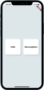
Output
Conclusion
Neumorphism offers a modern and visually appealing approach to Flutter app design. By leveraging shadows, gradients, and simplistic elements, you can create interfaces that blend realism and simplicity seamlessly. We’ve explored the key techniques, including shadow creation and gradient usage. Remember to maintain consistency and find the right balance to achieve the desired Neumorphic look in your Flutter apps. Now, it’s time to unleash your creativity and design stunning user interfaces!

