Introduction
As app design trends evolve, glassmorphism has emerged as a popular choice for creating visually stunning user interfaces. This design style mimics the appearance of glass or translucent surfaces, adding depth and a modern touch to app designs. In this comprehensive guide, we will explore how to implement glassmorphism in Flutter app designs. We’ll cover the essential techniques, provide step-by-step instructions, and include example code snippets to help you get started. Let’s dive in and bring a touch of elegance to your Flutter apps!
1. Applying Background Blur
To achieve the glassmorphism effect, we start by creating a blurred background. In Flutter, we can use the BackdropFilter widget combined with the ImageFilter.blur function to create the blur effect. Wrap the desired widget or container with a BackdropFilter widget and set its filter property to ImageFilter.blur. Adjust the sigmaX and sigmaY values to control the intensity of the blur effect.
BackdropFilter(
  filter: ImageFilter.blur(sigmaX: 5, sigmaY: 5),
  child: Container(
    // Your content here
  ),
)
2. Adding Translucency
Translucency is a key component of the glassmorphism effect. By adjusting the transparency level of UI elements, we can create the illusion of embedded glass surfaces. In Flutter, you can achieve translucency by setting the alpha value of the Color used for the UI elements. A lower alpha value (e.g., 50) makes the element more transparent.
Container(
  color: Colors.blue.withOpacity(0.5),
  // Your content here
)
3. Applying Gradients and Glow Effects
Gradients and glow effects add depth and dimension to glassmorphic designs. In Flutter, we can utilize the Container widget and BoxDecoration class to apply these visual effects. Experiment with linear or radial gradients and adjust the colors and stops to achieve your desired effect. To add a subtle glowing appearance, include a box shadow.
Container(
  decoration: BoxDecoration(
    gradient: LinearGradient(
      colors: [Colors.white, Colors.blue],
      stops: [0.2, 0.8],
    ),
    boxShadow: [
      BoxShadow(
        color: Colors.blue.withOpacity(0.5),
        blurRadius: 10,
        spreadRadius: 2,
      ),
    ],
  ),
  // Your content here
)
4. Consistent Styling
To ensure a cohesive glassmorphic design, it’s crucial to maintain consistency throughout your app. Use a consistent color palette, shadow intensity, and blur effect. This consistency enhances the overall user experience and reinforces the glassmorphic theme.
Sample Code
import 'package:flutter/material.dart';
import 'package:glassmorphism/glassmorphism.dart';

void main() {
  runApp(MyApp());
}

class MyApp extends StatelessWidget {
  @override
  Widget build(BuildContext context) {
    return MaterialApp(
      title: 'Glassmorphism Example',
      theme: ThemeData(
        primarySwatch: Colors.blue,
      ),
      home: GlassmorphismExample(),
    );
  }
}

class GlassmorphismExample extends StatelessWidget {
  @override
  Widget build(BuildContext context) {
    return Scaffold(
      body: Stack(
        children: [
          Positioned.fill(
            child: Image.asset(
              'assets/background.jpg', // Replace with your own background image
              fit: BoxFit.cover,
            ),
          ),
          Center(
            child: GlassmorphicContainer(
              width: 300,
              height: 200,
              borderRadius: 20,
              blur: 20,
              alignment: Alignment.center,
              border: 2,
              linearGradient: LinearGradient(
                begin: Alignment.topLeft,
                end: Alignment.bottomRight,
                colors: [
                  Color(0xFFffffff).withOpacity(0.1),
                  Color(0xFFFFFFFF).withOpacity(0.05),
                ],
                stops: [
                  0.1,
                  1,
                ],
              ),
              borderGradient: LinearGradient(
                begin: Alignment.topLeft,
                end: Alignment.bottomRight,
                colors: [
                  Color(0xFFffffff).withOpacity(0.5),
                  Color((0xFFFFFFFF)).withOpacity(0.5),
                ],
              ),
              child: Center(
                child: Text(
                  'Hello, Glassmorphism!',
                  style: TextStyle(
                    fontSize: 24,
                    fontWeight: FontWeight.bold,
                    color: Colors.white,
                  ),
                ),
              ),
            ),
          ),
        ],
      ),
    );
  }
}
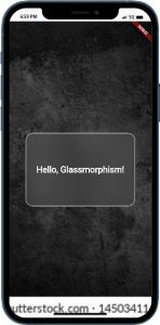
Output
Conclusion
By implementing glassmorphism in your Flutter app designs, you can create visually appealing and modern user interfaces. We’ve explored the key techniques, including background blurring, translucency, gradients, and glow effects. Remember to maintain consistency in your design choices to provide a cohesive user experience. Now, it’s time to bring your Flutter apps to life with the elegance and depth of glassmorphism!

