Building responsive Flutter applications is crucial to deliver a consistent and visually appealing user experience across a variety of screen sizes and aspect ratios. In this guide, we’ll explore techniques and widgets that help you handle aspect ratios and device constraints, ensuring your app looks great on every device.
Understanding MediaQuery and LayoutBuilder
To adapt your app’s layout based on the available screen space, you can leverage the MediaQuery and LayoutBuilder widgets. MediaQuery provides information about the device’s screen size, allowing you to dynamically adjust your UI elements. With LayoutBuilder, you can access the parent widget’s constraints and customize your layout accordingly.

// Example using MediaQuery and LayoutBuilder
import 'package:flutter/material.dart';

class MyWidget extends StatelessWidget {
  @override
  Widget build(BuildContext context) {
    return Scaffold(
      body: LayoutBuilder(
        builder: (context, constraints) {
          // Use constraints to customize your UI
          // based on available screen space
          return Container(
            width: constraints.maxWidth,
            height: constraints.maxHeight,
            // Rest of your UI elements
          );
        },
      ),
    );
  }
}
Maintaining Aspect Ratios with AspectRatio Widget
Sometimes, you need to maintain a specific aspect ratio for your UI elements, such as images or video players. Flutter provides the AspectRatio widget to handle this scenario seamlessly. You can set the desired aspect ratio and the widget will adjust its dimensions accordingly.
// Example using AspectRatio widget
import 'package:flutter/material.dart';

class MyWidget extends StatelessWidget {
  @override
  Widget build(BuildContext context) {
    return AspectRatio(
      aspectRatio: 16 / 9,
      child: Container(
        // Your UI elements within the AspectRatio widget
      ),
    );
  }
}
Adapting to Device Constraints with MediaQuery
To ensure your app adapts to different device constraints, such as screen size, status bar height, or app bar height, you can utilize MediaQuery to obtain device-specific information. This enables you to customize your UI elements based on the available space.
// Example using MediaQuery for device constraints
import 'package:flutter/material.dart';

class MyWidget extends StatelessWidget {
  @override
  Widget build(BuildContext context) {
    final mediaQuery = MediaQuery.of(context);
    final screenWidth = mediaQuery.size.width;
    final screenHeight = mediaQuery.size.height;
    final statusBarHeight = mediaQuery.padding.top;
    final appBarHeight = kToolbarHeight;

    return Scaffold(
      body: Container(
        width: screenWidth,
        height: screenHeight - statusBarHeight - appBarHeight,
        // Rest of your UI elements
      ),
    );
  }
}
Final Code :
import 'package:flutter/material.dart';

/// Flutter code sample for [ListTile].

void main() => runApp(const ListTileApp());

class ListTileApp extends StatelessWidget {
  const ListTileApp({super.key});

  @override
  Widget build(BuildContext context) {
    return MaterialApp(
      debugShowCheckedModeBanner: false,
      theme: ThemeData(
        listTileTheme: const ListTileThemeData(
          textColor: Colors.white,
        ),
        useMaterial3: true,
      ),
      home: MyWidget(),
    );
  }
}

class MyWidget extends StatelessWidget {
  @override
  Widget build(BuildContext context) {
    return Scaffold(
      appBar: AppBar(
        title: Text('Responsive App'),
      ),
      body: SingleChildScrollView(
        child: ConstrainedBox(
          constraints: BoxConstraints(
            minHeight: MediaQuery.of(context).size.height -
                AppBar().preferredSize.height -
                MediaQuery.of(context).padding.top,
          ),
          child: IntrinsicHeight(
            child: Container(
              color: Colors.black,
              child: Column(
                crossAxisAlignment: CrossAxisAlignment.stretch,
                children: [
                  AspectRatio(
                    aspectRatio: 16 / 9,
                    child: FlutterLogo(size: double.infinity),
                  ),
                  Expanded(
                    child: Container(
                      color: Colors.white,
                      child: Center(
                        child: Text(
                          'Content',
                          style: TextStyle(
                            fontSize: 24.0,
                            color: Colors.black,
                          ),
                        ),
                      ),
                    ),
                  ),
                ],
              ),
            ),
          ),
        ),
      ),
    );
  }
}
Output:
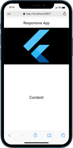
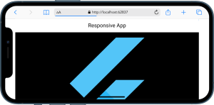
By implementing these techniques, you can create responsive Flutter apps that gracefully adapt to different aspect ratios and device constraints. Ensure a delightful user experience on screens of all sizes, ultimately leading to increased user engagement and satisfaction.

