Introduction:
In a Flutter app, checkbox and switch widgets provide a convenient way to capture user input for binary choices or preferences. Whether it’s for toggling a setting, selecting multiple options, or indicating an on/off state, checkboxes and switches are commonly used elements in user interfaces. In this step-by-step guide, you will learn how to add checkbox and switch widgets for user input in a Flutter app. By following this tutorial, you will be able to implement interactive checkboxes and switches and capture user preferences based on their selections.
Content:
1. Set up a new Flutter project:
Ensure that you have Flutter installed and set up on your machine. Create a new Flutter project using the following command in your terminal:
flutter create checkbox_switch_app
2. Implement a checkbox widget:
In the Dart file where you want to implement the checkbox widget, import the necessary packages:
import 'package:flutter/material.dart';
Inside the build method of your widget, define a boolean variable to store the checkbox state:
bool isChecked = false;
Use the Checkbox widget to create the checkbox:
Checkbox(
  value: isChecked,
  onChanged: (value) {
    setState(() {
      isChecked = value;
    });
  },
),
3. Implement a switch widget:
In the same Dart file, define another boolean variable to store the switch state:
bool isSwitched = false;
Use the Switch widget to create the switch:
Switch(
  value: isSwitched,
  onChanged: (value) {
    setState(() {
      isSwitched = value;
    });
  },
),
4. Use the checkbox and switch widgets in your app:
In the Dart file where you want to use the checkbox and switch widgets, import the necessary packages and add them to your widget tree.
import 'package:flutter/material.dart';

class MyScreen extends StatefulWidget {
  @override
  _MyScreenState createState() => _MyScreenState();
}

class _MyScreenState extends State<MyScreen> {
  bool isChecked = false;
  bool isSwitched = false;

  @override
  Widget build(BuildContext context) {
    return Scaffold(
      appBar: AppBar(
        title: Text('Checkbox and Switch'),
      ),
      body: Center(
        child: Column(
          mainAxisAlignment: MainAxisAlignment.center,
          children: [
            Checkbox(
              value: isChecked,
              onChanged: (value) {
                setState(() {
                  isChecked = value;
                });
              },
            ),
            SizedBox(height: 16),
            Switch(
              value: isSwitched,
              onChanged: (value) {
                setState(() {
                  isSwitched = value;
                });
              },
            ),
          ],
        ),
      ),
    );
  }
}
5. Capture user input:
To capture the user input from the checkbox and switch widgets, you can use the isChecked and isSwitched variables in your Flutter app. You can utilize these values for further processing, such as storing user preferences, updating UI elements, or performing specific actions based on the selected state.
6. Test the checkbox and switch widgets:
Save your changes and run the app using the following command in your terminal:
flutter run
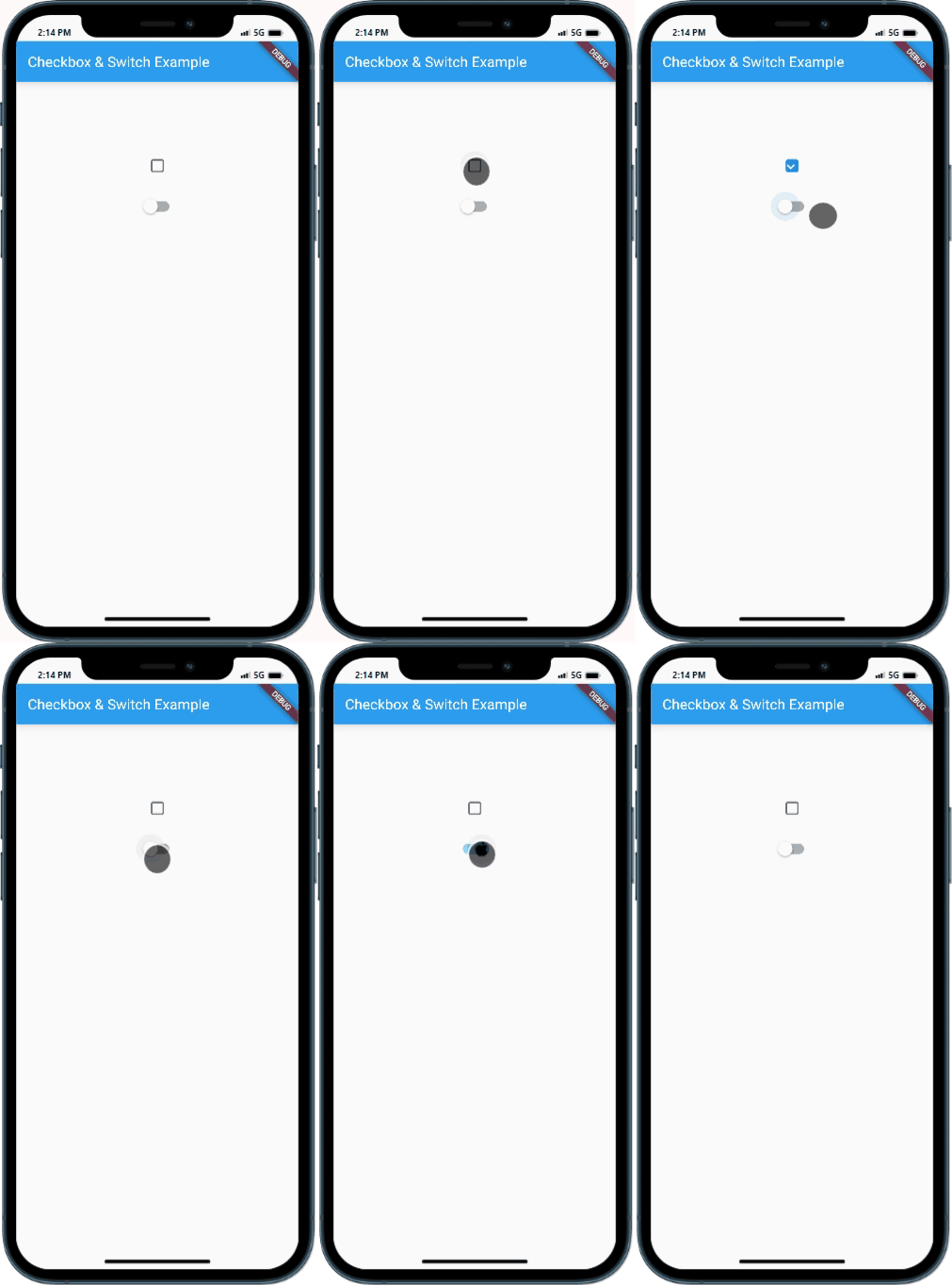
Upon running the app, you will see a checkbox and a switch widget. Toggling the checkbox will update the isChecked variable, while toggling the switch will update the isSwitched variable.
Sample Code:
import 'package:flutter/material.dart';

class CheckboxSwitchExample extends StatefulWidget {
  @override
  _CheckboxSwitchExampleState createState() => _CheckboxSwitchExampleState();
}

class _CheckboxSwitchExampleState extends State<CheckboxSwitchExample> {
  bool isChecked = false;
  bool isSwitched = false;

  @override
  Widget build(BuildContext context) {
    return Scaffold(
      appBar: AppBar(
        title: Text('Checkbox & Switch Example'),
      ),
      body: Center(
        child: Column(
          mainAxisAlignment: MainAxisAlignment. start,
          children: [
            SizedBox(height: 100,),
            Checkbox(
              checkColor:   Colors. white,
       shape: RoundedRectangleBorder(
    borderRadius: BorderRadius.circular(3.0),
  ), // with the help of shape you can gave any shape like circular ,trangular to your checkbox
              value: isChecked,
              onChanged: (value) {
                setState(() {
                  isChecked = value!;
                });
              },
            ),
            SizedBox(height: 20),
            Switch(
          // comment activeThumbImage if you dont wont to use thamb image
activeThumbImage: Image.network('https://upload.wikimedia.org/wikipedia/commons/thumb/f/fa/Apple_logo_black.svg/256px-Apple_logo_black.svg.png',fit:BoxFit. cover,).image,

              // activeColor: Colors.black,   //gave color to your switch when its on
              value: isSwitched,
              onChanged: (value) {
                setState(() {
                  isSwitched = value;
                });
              },
            ),
          ],
        ),
      ),
    );
  }
}

void main() {
  runApp(MaterialApp(
    home: CheckboxSwitchExample(),
  ));
}
Output:

Conclusion:
Congratulations! You have successfully learned how to add checkbox and switch widgets for user input in a Flutter app. By following this step-by-step guide, you can now implement interactive checkboxes and switches to capture user preferences and choices. Utilize these widgets in your Flutter app to enhance the user experience and provide intuitive user interactions.


