Introduction:
Responsive design is a crucial aspect of mobile app development, ensuring that your app’s user interface (UI) adapts and adjusts to different screen sizes and orientations. In Flutter, Google’s UI toolkit for building beautiful apps, you have the power to create responsive and adaptive UIs that provide a consistent and optimal experience across various devices, from smartphones to tablets and desktops. In this article, we will explore the principles and best practices of responsive design in Flutter and provide code examples to help you understand and implement these concepts effectively.
Understanding Responsive Design in Flutter
When it comes to responsive design in Flutter, there are several key principles to consider. Let’s dive into each of them and understand how they contribute to creating adaptive user interfaces.
1. MediaQuery
One of the fundamental classes in Flutter for responsive design is MediaQuery. It provides access to device-specific information, such as screen size, orientation, and pixel density. By utilizing MediaQuery, you can dynamically adjust your UI layout and components based on the available screen space.
// Example: Retrieving the screen size
final screenSize = MediaQuery.of(context).size;
2. Flexible and Expanded Widgets
To ensure your UI elements flexibly adjust their sizes based on available space, Flutter provides the Flexible and Expanded widgets. These widgets allow your UI to expand or shrink to fit different screen dimensions, providing a responsive layout.
// Example: Using Flexible widget
Flexible(
  flex: 1,
  child: Container(
    color: Colors.red,
  ),
),
3. LayoutBuilder
The LayoutBuilder widget is another powerful tool for responsive design in Flutter. It provides access to the constraints of its parent widget, enabling you to create responsive layouts that adapt to the available space. You can utilize these constraints to customize the behavior and appearance of your UI elements.
// Example: Using LayoutBuilder to adjust widget based on constraints
LayoutBuilder(
  builder: (BuildContext context, BoxConstraints constraints) {
    return constraints.maxWidth > 600
        ? DesktopWidget()
        : MobileWidget();
  },
),
4. Responsive UI Breakpoints
Defining responsive UI breakpoints is crucial for creating adaptive user interfaces. Breakpoints represent different screen sizes, and by using conditional logic based on the device’s width or height, you can apply different layouts or modify the behavior of your UI elements. This helps optimize the user experience across various devices.
// Example: Using breakpoints to adjust UI behavior
Widget build(BuildContext context) {
  final screenWidth = MediaQuery.of(context).size.width;

  if (screenWidth > 600) {
    return WideScreenWidget();
  } else {
    return NarrowScreenWidget();
  }
}
5. Orientation Awareness
Handling changes in device orientation is essential for responsive design. By adjusting your UI layout based on whether the device is in portrait or landscape mode, you can provide a seamless experience. Utilize Flutter’s orientation awareness to modify the arrangement of widgets dynamically.
// Example: Adjusting widget arrangement based on orientation
OrientationBuilder(
  builder: (BuildContext context, Orientation orientation) {
    return orientation == Orientation.portrait
        ? Column(
            children: [WidgetA(), WidgetB()],
          )
        : Row(
            children: [WidgetA(), WidgetB()],
          );
  },
),
6. Adaptive UI
Flutter provides widgets like ListView.builder and GridView.builder that automatically adapt their layout based on the available space. Utilize these widgets to create scrollable lists or grids that adjust their item count and size based on the screen size, ensuring a responsive and optimal user interface.
// Example: Using ListView.builder for adaptive UI
ListView.builder(
  itemCount: items.length,
  itemBuilder: (BuildContext context, int index) {
    return ListTile(
      title: Text(items[index]),
    );
  },
),
7. Image Assets
Consider providing different sets of image assets with varying resolutions to ensure optimal image quality and performance on different screen densities. By adapting the image assets, you can enhance the visual experience of your app across a wide range of devices.
// Example: Loading different image assets based on screen density
Image.asset(
  'assets/images/flutter_logo@2x.png', // For higher density screens
),
Final Code
import 'package:flutter/material.dart';

void main() {
  runApp(MyApp());
}

class MyApp extends StatelessWidget {
  @override
  Widget build(BuildContext context) {
    return MaterialApp(
      title: 'Responsive Design Demo',
      theme: ThemeData(
        primarySwatch: Colors.blue,
      ),
      home: HomePage(),
    );
  }
}

class HomePage extends StatelessWidget {
  @override
  Widget build(BuildContext context) {
    final screenSize = MediaQuery.of(context).size;
    final isPortrait =
        MediaQuery.of(context).orientation == Orientation.portrait;

    return Scaffold(
      appBar: AppBar(
        title: Text('Responsive Design Demo'),
      ),
      body: LayoutBuilder(
        builder: (BuildContext context, BoxConstraints constraints) {
          return Column(
            children: [
              Container(
                height: 200,
                color: Colors.blue,
                child: Center(
                  child: Text(
                    'Header',
                    style: TextStyle(
                      color: Colors.white,
                      fontSize: 24,
                    ),
                  ),
                ),
              ),
              Expanded(
                child: Row(
                  children: [
                    if (constraints.maxWidth > 600 || !isPortrait)
                      Flexible(
                        flex: 1,
                        child: Container(
                          color: Colors.red,
                          child: Center(
                            child: Text(
                              'Sidebar',
                              style: TextStyle(
                                color: Colors.white,
                                fontSize: 18,
                              ),
                            ),
                          ),
                        ),
                      ),
                    Expanded(
                      flex: 2,
                      child: Container(
                        color: Colors.green,
                        child: Center(
                          child: Text(
                            'Content',
                            style: TextStyle(
                              color: Colors.white,
                              fontSize: 18,
                            ),
                          ),
                        ),
                      ),
                    ),
                  ],
                ),
              ),
              Container(
                height: 100,
                color: Colors.yellow,
                child: Center(
                  child: Text(
                    'Footer',
                    style: TextStyle(
                      color: Colors.black,
                      fontSize: 18,
                    ),
                  ),
                ),
              ),
            ],
          );
        },
      ),
    );
  }
}
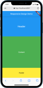
OUTPUT :

Conclusion:
In this article, we explored the principles and best practices of responsive design in Flutter. By utilizing concepts such as MediaQuery, Flexible and Expanded widgets, LayoutBuilder, breakpoints, orientation awareness, adaptive UI, and image assets, you can create adaptive and visually appealing user interfaces that seamlessly adapt to different screen sizes and orientations.
Remember to test your app on various devices and screen configurations to ensure a consistent and optimal user experience. Flutter’s flexibility and responsiveness make it a powerful framework for building apps that look great on any device.
Start implementing responsive design principles in your Flutter projects and provide your users with a delightful and adaptive app experience!

